
Improve Your Graphics Part 5
A beautifully designed chart can still fail.
Not because the data is wrong but because the background, formatting, or slide design competes with the message.
In Part 5 of our Improve Your Graphics series, we’ll show you a method to transfer a chart from Excel into PowerPoint without undermining your data’s impact and why background decisions matter.
Backgrounds and Graphics
In Improve Your Graphics Part 4, we inserted data into a spreadsheet, created a chart, noted the weaknesses in Excel’s default chart settings, and modified them for clarity and aesthetics.
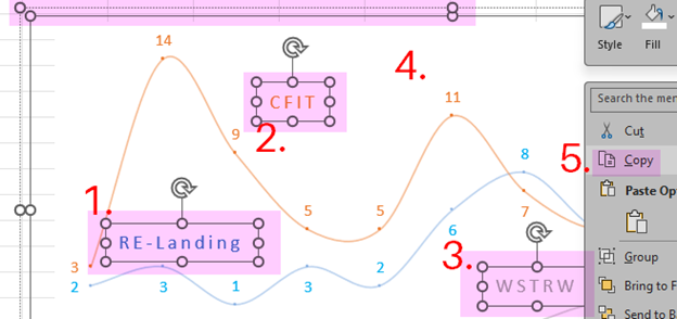
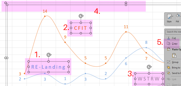
Now, we are going to copy that chart for insertion into a report or presentation. Because there are text boxes, this has multiple steps. Press the Shift key while left clicking on each text box (1, 2, and 3), and then right click in plot area (4). This adds circles on the edges of the selected boxes (allowing you to move and adjust the size of the boxes) and opens a menu. Click on “Copy” (5).
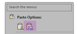
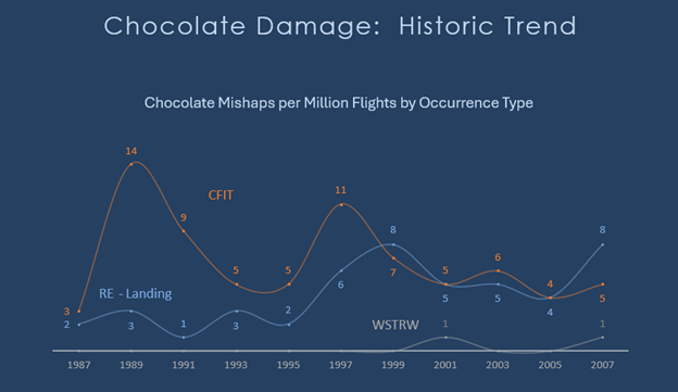
Unless you need the chart to remain interactive with the Excel file, paste it as an image into a PowerPoint slide.

Kind of underwhelming.
A graphic element with an opaque white rectangular or square background suggests the creator is new to this task—there are rare occasions when this look is desired, but this is not one of them.
Removing the opaque background is an option in Excel. Right click on the chart. Next, 1. “Fill,” and 2. “No Fill.”
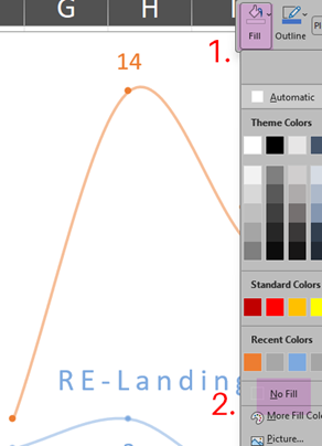
If the spreadsheet’s grid is visible, then the background is transparent.
Repeat the procedure above for copying the chart and the text boxes.
Finally, paste it into the slide.

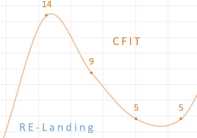
Now there is a different issue. The background of the slide is more prominent than the data in the chart. Remember, it’s all about the data: the data is why you created the chart and want to share it.
You could change the background of the chart (see instructions above) to complement the text color; however, you still have that box.

The root issue is the interaction between the backgrounds of the chart and the slide. (The slides’ background is secondary to the data.) It is, unfortunately, common to create a chart without planning how it will be displayed. The most widespread display method is in a Word document, which has a default white background. If that were the case here, this post would have ended with pasting the chart into the document.
For PowerPoint a white background is also the default, but that has issues for the viewer: frequently, the room lighting for a projected presentation is muted. In these situations, white backgrounds can increase eye strain. (For more help with projection, check out our articles on the pros and cons of front projection and rear projection.)
With this in mind, we can solve our issue by keeping the chart’s transparent background and changing the background of the slide from an image to a color. (And I could not resist playing with the font and spacing.)
There is no best way to create or display information—your job is to look at your creation as would the data’s consumer.
Does the formatting help or hinder the information transfer?
Could I simplify the layout?
Is any element of the display competing with the data for the viewer’s attention?
Want Help Making Your Charts Presentation-ready?
Explore our editing and graphics support services — or contact us for a quick review of your next report.
We welcome thoughtful and respectful discussion.
To keep this space safe and productive, please follow these guidelines:
Be respectful. Personal attacks, name-calling, and abusive language will not be tolerated.
Stay on topic. Keep comments relevant to the content of the post.
No spam or self-promotion. Links and promotions that are not relevant to the discussion will be removed.
Use appropriate language. This is a professional environment—please avoid profanity or offensive language.
Protect privacy. Don’t share personal information—yours or anyone else’s.
You may reply to, like, or flag other comments.
Comments are moderated and may be edited or removed at our discretion.
By commenting, you agree to abide by this policy.