
Improve Your Graphics, Pt. 1
Graphics, images, figures, illustrations are vital parts of reports and presentations. As with tables (check out this post, this post, and this post), these elements are all about the data.
Borders
High contrast borders are an enemy to data transfer—the same principle we discussed in Improving Your Tables applies to any text surrounded by a box.
Such borders activate the space around them causing them to vibrate visually. This action competes with the data, slowing down the transfer of data to the viewer’s mind.

The image is recreated below, minus the borders. Notice how the data is set free; no lines.

Less is More
The dominant features of the graphic below are the colorful, bold images and title; however, the reason this graphic was created, to outline the certification cycle—found in the text—is buried.
There is an urge to fill any figure or chart with images, and it is easy to go too far.

In the simplified re-creation below we have:
Changed the title to a reasonable format—its position and size is enough to indicate it’s the title.
Removed the distracting icons that overpowered the text. Remember, if you think your data is boring, then you need to get better data. Cute images will not save thin data.
Increased the text size to fill the space formerly occupied by the distracting images.
Softened the arrows; their indication of direction is secondary to the text. Our brains interpret softer, fuzzier images and colors as being in the background, like a shadow.
Removed the apostrophes in the image. For more information, check out this post.

An example of simplifying a graphic is the U.S. Department of Agriculture Food Pyramid. Its original 1992 form confused many. How large is one serving? Why are the items we are to use sparingly at the top? It looks like I should eat a great deal of bread.

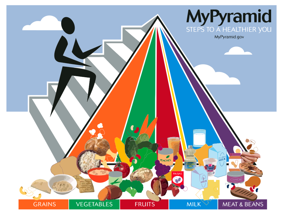
In 2005, the pyramid was updated, although graphically, it was a step backwards. Now I have no idea how much of each food group to eat, only a rough comparison to the other groups. The fats, oils, and sweets from the original are now in the unnamed and extremely acute triangle between fruits and milk. The person climbing the stairs to remind us to exercise and the additional words “Steps to a Healthier You” show a loss of focus. The food pyramid is about food and it is already confusing without adding other information.
In 2011, a simpler version was presented. Because I have seen and used a plate, fork, and cup, I now have a frame of reference for approximately how much of each group I should consume. The goal of any graphic is to be easily understood. Shorten the “figuring what this means” time—the best graphics could be described as, “Behold!”

Since MyPlate’s introduction, dietary recommendations have become more complex, but this graphic’s simplification of the original concept is a good lesson for creators.
Tell us in the comments about graphics that you wish more people would emulate as well as the graphics you hope will never be used again.
Back to Stet Happens: All Things Editorial home.
Do you have questions or concerns about editorial matters? Share them with us!
PAI Consulting | Helping you succeed. Learn more.
Any opinions expressed in this article are those of the author and not the opinion of PAI Consulting. In addition, this article may contain links to third-party websites. PAI Consulting does not endorse or make any representations about them, or any information, software, or other products or materials found there, or any results that may be obtained from using them.