
Improve Your Graphics Part 4
In our July 22 post, Improve Your Graphics Part 3, we presented a basic chart produced by Excel’s default settings.
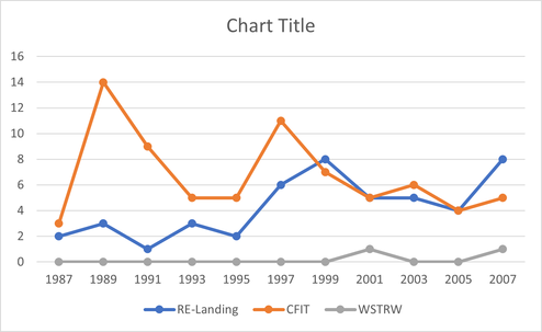
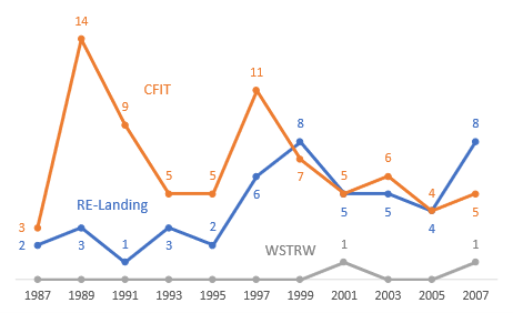
We then removed the default elements that were distracting or redundant and thoughtfully replaced the relevant pieces. Now, there is no need to look back and forth between a data point and a side scale; no need to find a key and then look back to your line; no title when the figure will be named in the document; and no box surrounding the chart. We integrated the numbers and key with the lines—it’s all data.
Now, we’ll try to improve the aesthetics.
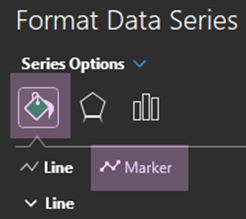
Right‑click on the line you wish to change->Format Data Series->Line.

Narrow the width of the line—in this example, by 1 pt.

For comparison, the top line is 1 pt. and the bottom one is the default: 2.25 pt.

Repeat with the remaining lines. Remember: the line is secondary to the data points; reducing its size moves the numbers to the front.

Next, right‑click on one of the data point->Format Data Series.

Click on the paint bucket icon, then on Marker.
Toggle the “>” next to Marker Options.
Reduce the size—in this example, to 2.

For comparison, the top marker is 2 and the bottom one is the default: 5. This is the same idea as reducing the line’s width.

Repeat on the remaining markers.
To make the data point stand out more than the line, you could increase the lines’ transparency.


Changing the default font can also add some elegance. Click on the text box and highlight the text you wish to change.
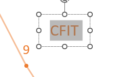
In this example we changed the text to Century Gothic. This is a personal choice; however, generally sans‑serif fonts are best for labels and headings.


Expanding the letter spacing is a nice touch. Highlight the text, right‑click, and select Font.
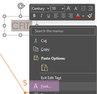
Select the Character Spacing tab, change Spacing to Expanded and increase the By number.

The increased spacing gives importance to the text, setting it off from normally spaced text. If you have not used this feature before, it will require some experimentation.

Repeat for the remaining text boxes.

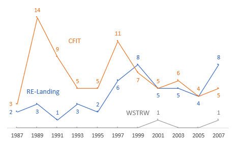
It is often easier to notice trends in charts that can be described as “lumpy” as opposed to “spiky.” This chart is spiky. Right‑click on a line->Format Data Series->Paint Bucket Icon->Line.

At the bottom of the menu, check the Smoothed line box.


Repeat for the remaining lines.

If your chart’s purpose is to display slight variations instead of larger trends, then keep the spiky line—small changes almost disappear in lumpy charts.
The final change to increase the lumpiness is to click on the right edge of the chart and stretch it to the right. You will probably need to adjust the placement of the text boxes.

Compare the edited chart to the original.

Remember, all these steps are suggestions. If your client wants default charts, give them default charts; however, you can always slip in an improved chart—they may not know what is possible.
The secondary goal of this series is to expose you to some of the options built into the programs you use every day. Yes, these suggestions take more time, but they will make your charts look more professional.
#ExcelTips, #DataVisualization, #ChartDesign, #PresentationSkills, #ProfessionalCharts
Back to Stet Happens: All Things Editorial home.
Do you have questions or concerns about editorial matters? Share them with us!
PAI Consulting | Helping you succeed. Learn more.
Any opinions expressed in this article are those of the author and not the opinion of PAI Consulting. In addition, this article may contain links to third-party websites. PAI Consulting does not endorse or make any representations about them, or any information, software, or other products or materials found there, or any results that may be obtained from using them.
We welcome thoughtful and respectful discussion.
To keep this space safe and productive, please follow these guidelines:
Be respectful. Personal attacks, name-calling, and abusive language will not be tolerated.
Stay on topic. Keep comments relevant to the content of the post.
No spam or self-promotion. Links and promotions that are not relevant to the discussion will be removed.
Use appropriate language. This is a professional environment—please avoid profanity or offensive language.
Protect privacy. Don’t share personal information—yours or anyone else’s.
You may reply to, like, or flag other comments.
Comments are moderated and may be edited or removed at our discretion.
By commenting, you agree to abide by this policy.